EXTRA Credit Card: Website Redesign (mobile)

Overview
This project was a short-form UX/UI exercise focused on redesigning a landing page hero section for a credit card aimed at everyday spending (groceries, gas, daily purchases). The goal was to improve clarity, visual communication and conversion potential by testing different content structures and design directions.
My role
As the sole designer, I was responsible for redesigning the hero section from scratch, crafting multiple visual and messaging iterations, improving CTA visibility and user motivation, aligning design decisions with CRO best practices.
Key focus areas
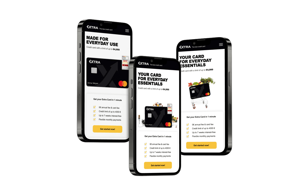
Aligning messaging with how the card is actually used (daily expenses)
Visual hierarchy: highlighting the most critical information (“0 € fees,” “apply in 1 minute”)
CTA optimization: improve placement and clarity of calls-to-action using a sticky footer and repeated final CTA
Testing different ways of communicating core benefits (practical vs aspirational tone)
Exploring how layout, headlines, and visuals support user decision-making
Tools and methods used
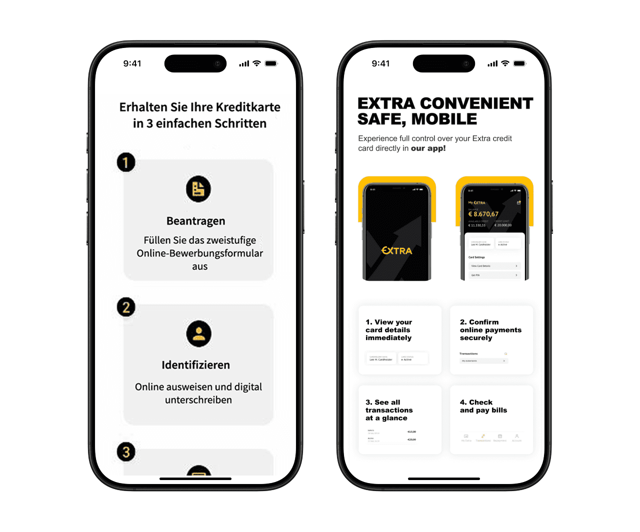
Figma for wireframing and high-fidelity UI design.
CRO principles applied on call-to-action placement, benefit framing, and attention flow.
Competitive analysis: studied existing landing pages for credit cards and financial tools to benchmark best practices.
Visual iteration: designed multiple hero variants with different headline tones and imagery to prepare for A/B testing.
Key focus areas
Aligning messaging with how the card is actually used (daily expenses)
Visual hierarchy: highlighting the most critical information (“0 € fees,” “apply in 1 minute”)
CTA optimization: improve placement and clarity of calls-to-action using a sticky footer and repeated final CTA
Testing different ways of communicating core benefits (practical vs aspirational tone)
Exploring how layout, headlines, and visuals support user decision-making
Tools and methods used
Figma for wireframing and high-fidelity UI design.
CRO principles applied on call-to-action placement, benefit framing, and attention flow.
Competitive analysis: studied existing landing pages for credit cards and financial tools to benchmark best practices.
Visual iteration: designed multiple hero variants with different headline tones and imagery to prepare for A/B testing.