Admin Dashboard
for Fashion Tech Startup
Overview
A virtual dressing room startup needed an internal admin dashboard for third-party fashion brands (Zara, H&M, etc) to manage accounts, upload clothing inventory, track analytics, and control settings — all without technical knowledge.
Challenge
Create admin dashboard that feels professional yet fashionable — technical enough for data management, simple enough for non-technical fashion brand representatives.
My role
Solo Freelance UX/UI Designer
Team & Timeline
(1 month, Mar – Apr 2026)
Admin Dashboard
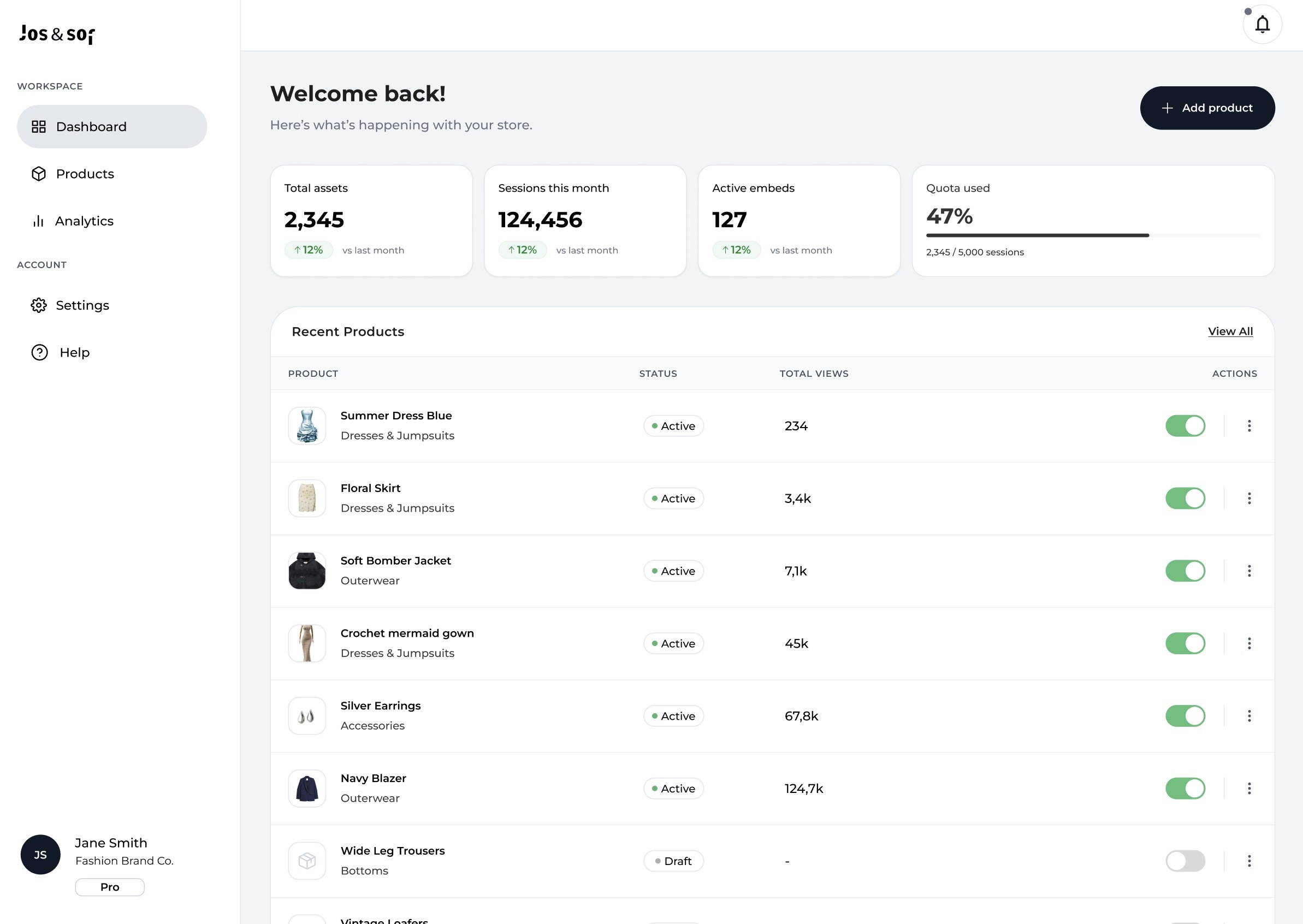
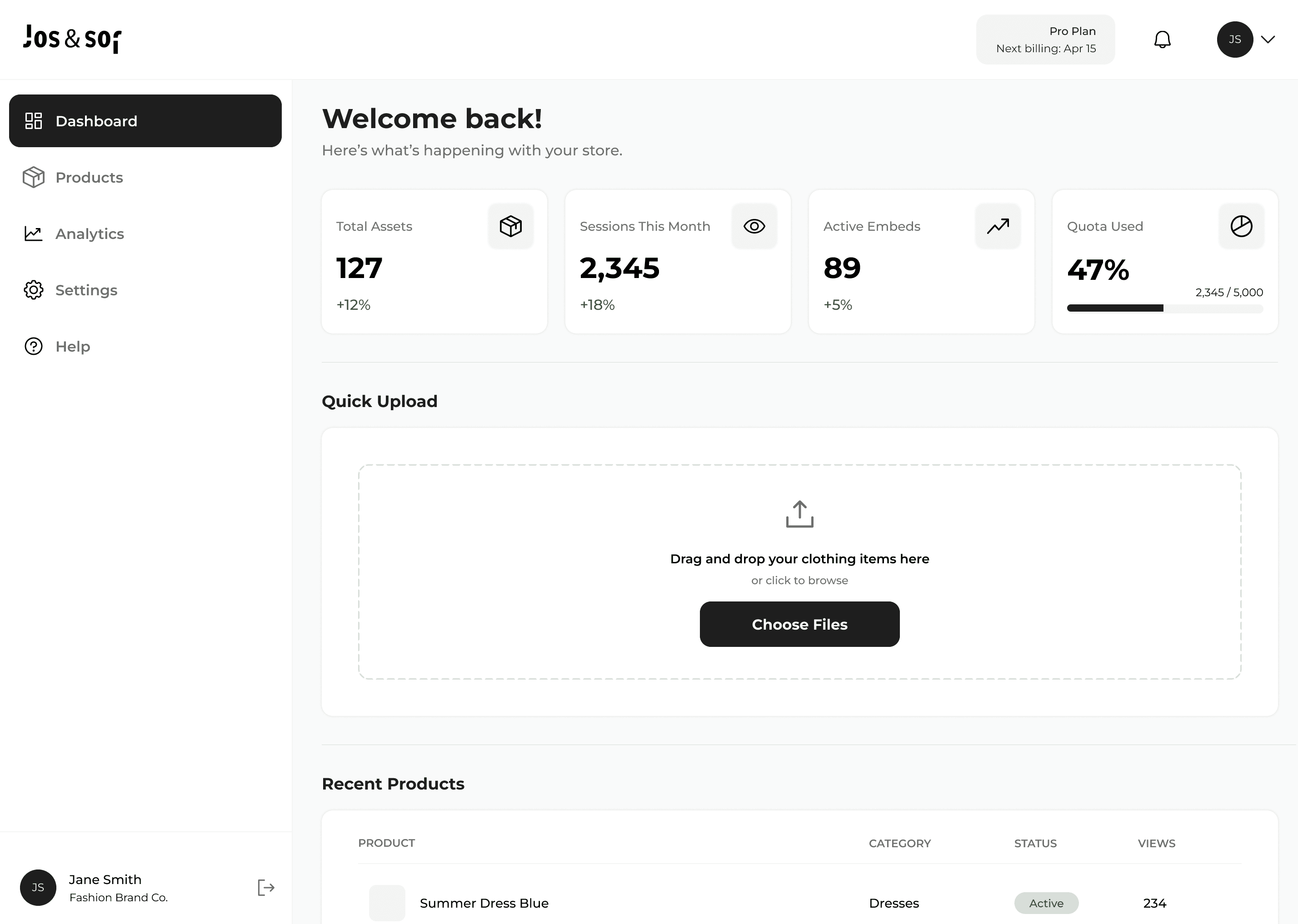
Contextual Sidebar Split: Navigation is strictly split between daily utilities (Workspace) and secondary options (Account). Active states use a soft gray pill to keep the sidebar quiet, letting the main data breathe.
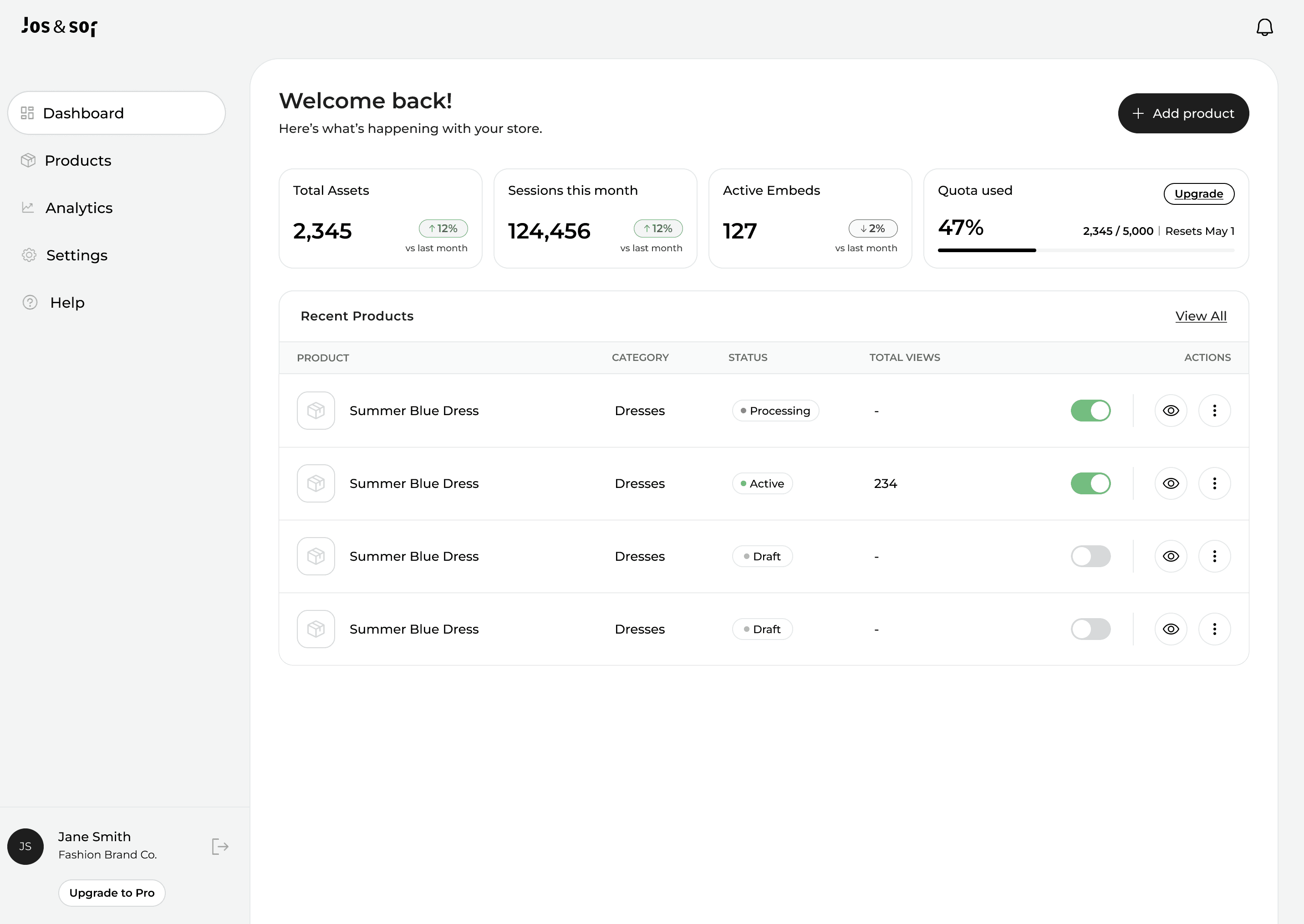
Glanceable Metrics: Core KPIs leverage heavy typographic weight for instant scanning. A dedicated progress bar visualizes asset quota limits (47%), shifting the user's cognitive load from reading numbers to recognizing shapes.
Frictionless Status Controls: row-level active/draft toggles sit directly on the surface for single-click state changes — no detail pages required. Secondary actions are cleanly tucked away behind a 3-dot menu.
Strict Semantic Coloring: green is weaponized exclusively for utility: positive trends (+12%) and active states (Active). The rest of the interface remains strictly neutral to eliminate visual clutter.
Product Management
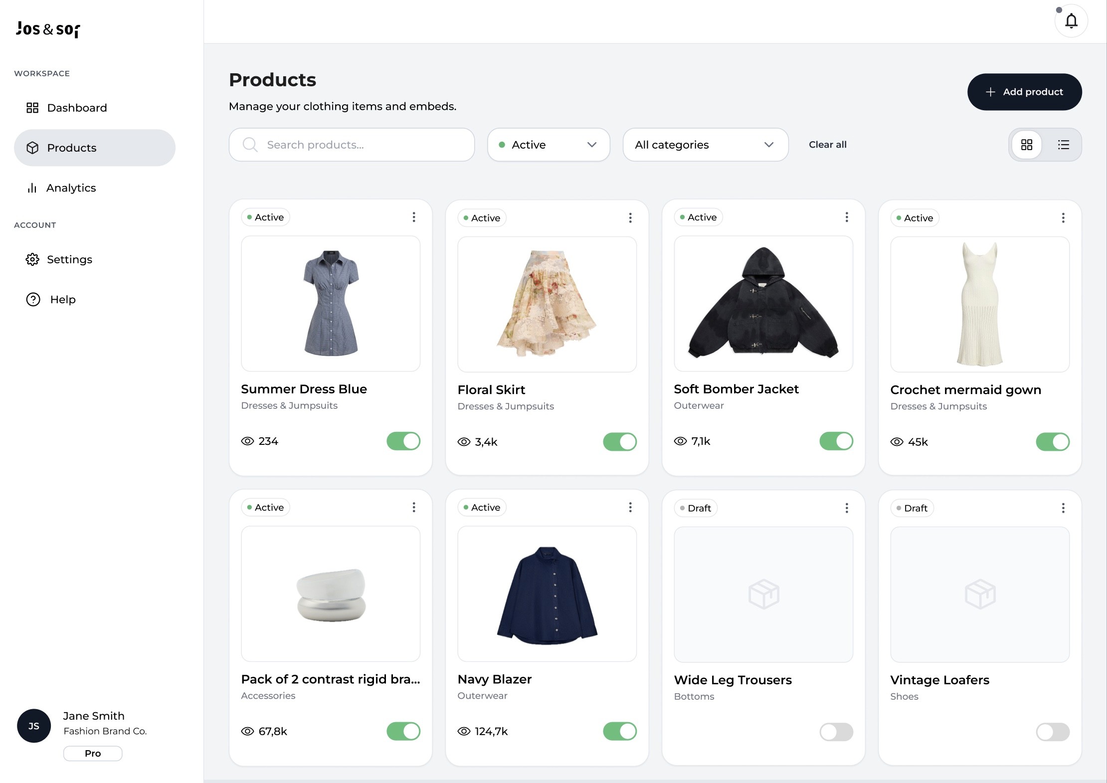
Dual View Architecture: introduced a view-switch toggle (Grid/List) in the top right. The grid view relies on uniform aspect-ratio cards to prioritize product imagery, while the list view remains optimized for text-heavy data sorting.
Aspect-Ratio & Empty States: product cards use a distinct square bounding box container. For products currently lacking assets (Wide Leg Trousers, Vintage Loafers), a custom minimalist placeholder icon maintains layout integrity and visual consistency.
Row-Level Hierarchy & Micro-Interactions: the top of each card features an isolated status badge (Active / Draft) and a 3-dot context menu for destructive/secondary actions (Delete, Get Embed Code). The bottom footer isolates numerical data (Views count) from interactive states (Toggle switch), giving the user a clear click target to change item status seamlessly.
Dual View Architecture: introduced a view-switch toggle (Grid/List) in the top right. The grid view relies on uniform aspect-ratio cards to prioritize product imagery, while the list view remains optimized for text-heavy data sorting.
Aspect-Ratio & Empty States: product cards use a distinct square bounding box container. For products currently lacking assets (Wide Leg Trousers, Vintage Loafers), a custom minimalist placeholder icon maintains layout
integrity and visual consistency.
Row-Level Hierarchy & Micro-Interactions: the top of
each card features an isolated status badge (Active / Draft)
and a 3-dot context menu for destructive/secondary actions (Delete, Get Embed Code). The bottom footer isolates numerical data (Views count) from interactive states
(Toggle switch), giving the user a clear click target to change item status seamlessly.
Analytics
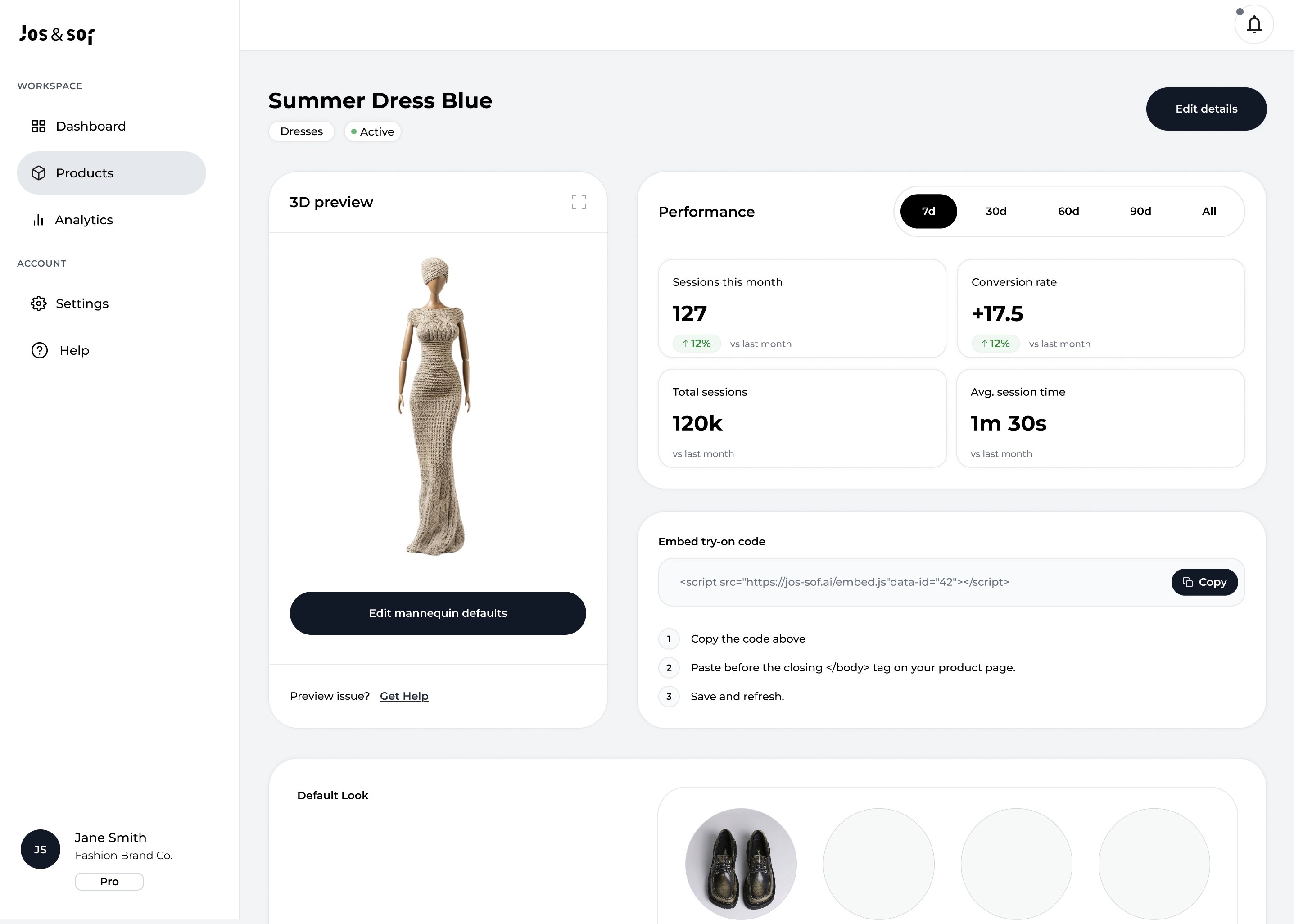
ROI Visualization: instead of a single trend line, the chart maps a dashed baseline under the solid green line tracking our tool's impact. The physical gap between them acts as instant proof of profit. To reduce cognitive load, the +17.5% metric includes a plain-English summary — giving managers a scannable insight they can copy-paste straight into stakeholder reports.
Silent hierarchy: the time-range selector sits intentionally as a structural divider between the macro-overview and the lower micro-widgets. This zoning builds an intuitive mental model, signaling that the selected timeframe governs everything below without relying on heavy visual labels.
Colour strategy: the UI remains heavily monochrome, weaponizing the signature green accent exclusively for positive trajectories and active states. It serves as an undeniable beacon: wherever the user sees green, the system communicates success.
ROI Visualization: instead of a single trend line, the chart maps a dashed baseline under the solid green line tracking our tool's impact. The physical gap between them acts as instant proof of profit. To reduce cognitive load, the +17.5% metric includes a plain-English summary — giving managers a scannable insight they can copy-paste straight into stakeholder reports.
Silent hierarchy: the time-range selector sits intentionally as a structural divider between the macro-overview and the lower micro-widgets. This zoning builds an intuitive mental model, signaling that the selected timeframe governs everything below without relying on heavy visual labels.
Colour strategy: the UI remains heavily monochrome, weaponizing the signature green accent exclusively for positive trajectories and active states. It serves as an undeniable beacon: wherever the user sees green, the system communicates success.
ROI Visualization: instead of a single trend line, the chart maps a dashed baseline under the solid green line tracking our tool's impact. The physical gap between them acts as instant proof of profit. To reduce cognitive load, the +17.5% metric includes a plain-English summary — giving managers a scannable insight they can copy-paste straight into stakeholder reports.
Silent hierarchy: the time-range selector sits intentionally as a structural divider between the macro-overview and the lower micro-widgets. This zoning builds an intuitive mental model, signaling that the selected timeframe governs everything below without relying on heavy visual labels.
Colour strategy: the UI remains heavily monochrome, weaponizing the signature green accent exclusively for positive trajectories and active states. It serves as an undeniable beacon: wherever the user sees green, the system communicates success.
Settings
ROI Visualization: instead of a single trend line, the chart maps a dashed baseline under the solid green line tracking our tool's impact. The physical gap between them acts as instant proof of profit. To reduce cognitive load, the +17.5% metric includes a plain-English summary — giving managers a scannable insight they can copy-paste straight into stakeholder reports.
Silent hierarchy: the time-range selector sits intentionally as a structural divider between the macro-overview and the lower micro-widgets. This zoning builds an intuitive mental model, signaling that the selected timeframe governs everything below without relying on heavy visual labels.
Colour strategy: the UI remains heavily monochrome, weaponizing the signature green accent exclusively for positive trajectories and active states. It serves as an undeniable beacon: wherever the user sees green, the system communicates success.
ROI Visualization: instead of a single trend line, the chart maps a dashed baseline under the solid green line tracking our tool's impact. The physical gap between them acts as instant proof of profit. To reduce cognitive load, the +17.5% metric includes a plain-English summary — giving managers a scannable insight they can copy-paste straight into stakeholder reports.
Silent hierarchy: the time-range selector sits intentionally as a structural divider between the macro-overview and the lower micro-widgets. This zoning builds an intuitive mental model, signaling that the selected timeframe governs everything below without relying on heavy visual labels.
Colour strategy: the UI remains heavily monochrome, weaponizing the signature green accent exclusively for positive trajectories and active states. It serves as an undeniable beacon: wherever the user sees green, the system communicates success.
Split-screen layout: the layout uses a strict 70/30 split: technical data inputs on the left, and a sticky, real-time Live Preview viewport of the mannequin on the right.The "Why": Eliminates the traditional "save, refresh, and check" loop. Instantly visualizes changes to backdrops, hair, or skin tones, dropping configuration errors to zero.
Multi-select mechanics: the Backdrop Colors section features a strict selection rule backed by micro-copy below the grid (Default: cream — enabled: 2 of 5). Prevents front-end storefront crashes caused by users accidentally deselecting all options. The explicit default marker ensures the platform always has a valid fallback state.
Visual Pickers: mannequin attributes (type, skin tone, hairstyle) ditch text dropdowns in favor of large, geometric graphic choice pickers. Circular color swatches and vector silhouettes allow the eye to process choices instantly without reading.
Payment flow
Conversion-Driven Tiering: elevated the Growth tier with a "most popular" badge and mutes the Starter plan to shift visual weight onto high-contrast Upgrade buttons.
Annual incentive & validation: used a high-contrast billing toggle ("save up to 50%") and paired order summary volume ceilings with crossed-out rates to validate immediate ROI.
Incentivized in-line add-ons: embedded checkbox-driven "Recommended Add-ons" directly into the checkout review flow to capture last-minute, friction-free expansion revenue.
Anxiety relief and clear CTA: featured a "Next billing" calendar widget to clarify future renewal dates, anchoring the flow with a dominant, high-contrast Confirm action.
ROI Visualization: instead of a single trend line, the chart maps a dashed baseline under the solid green line tracking our tool's impact. The physical gap between them acts as instant proof of profit. To reduce cognitive load, the +17.5% metric includes a plain-English summary — giving managers a scannable insight they can copy-paste straight into stakeholder reports.
Silent hierarchy: the time-range selector sits intentionally as a structural divider between the macro-overview and the lower micro-widgets. This zoning builds an intuitive mental model, signaling that the selected timeframe governs everything below without relying on heavy visual labels.
Colour strategy: the UI remains heavily monochrome, weaponizing the signature green accent exclusively for positive trajectories and active states. It serves as an undeniable beacon: wherever the user sees green, the system communicates success.
Split-screen layout: the layout uses a strict 70/30 split: technical data inputs on the left, and a sticky, real-time Live Preview viewport of the mannequin on the right.The "Why": Eliminates the traditional "save, refresh, and check" loop. Instantly visualizes changes to backdrops, hair, or skin tones, dropping configuration errors to zero.
Multi-select mechanics: the Backdrop Colors section features a strict selection rule backed by micro-copy below the grid (Default: cream — enabled: 2 of 5). Prevents front-end storefront crashes caused by users accidentally deselecting all options. The explicit default marker ensures the platform always has a valid fallback state.
Visual Pickers: mannequin attributes (type, skin tone, hairstyle) ditch text dropdowns in favor of large, geometric graphic choice pickers. Circular color swatches and vector silhouettes allow the eye to process choices instantly without reading.